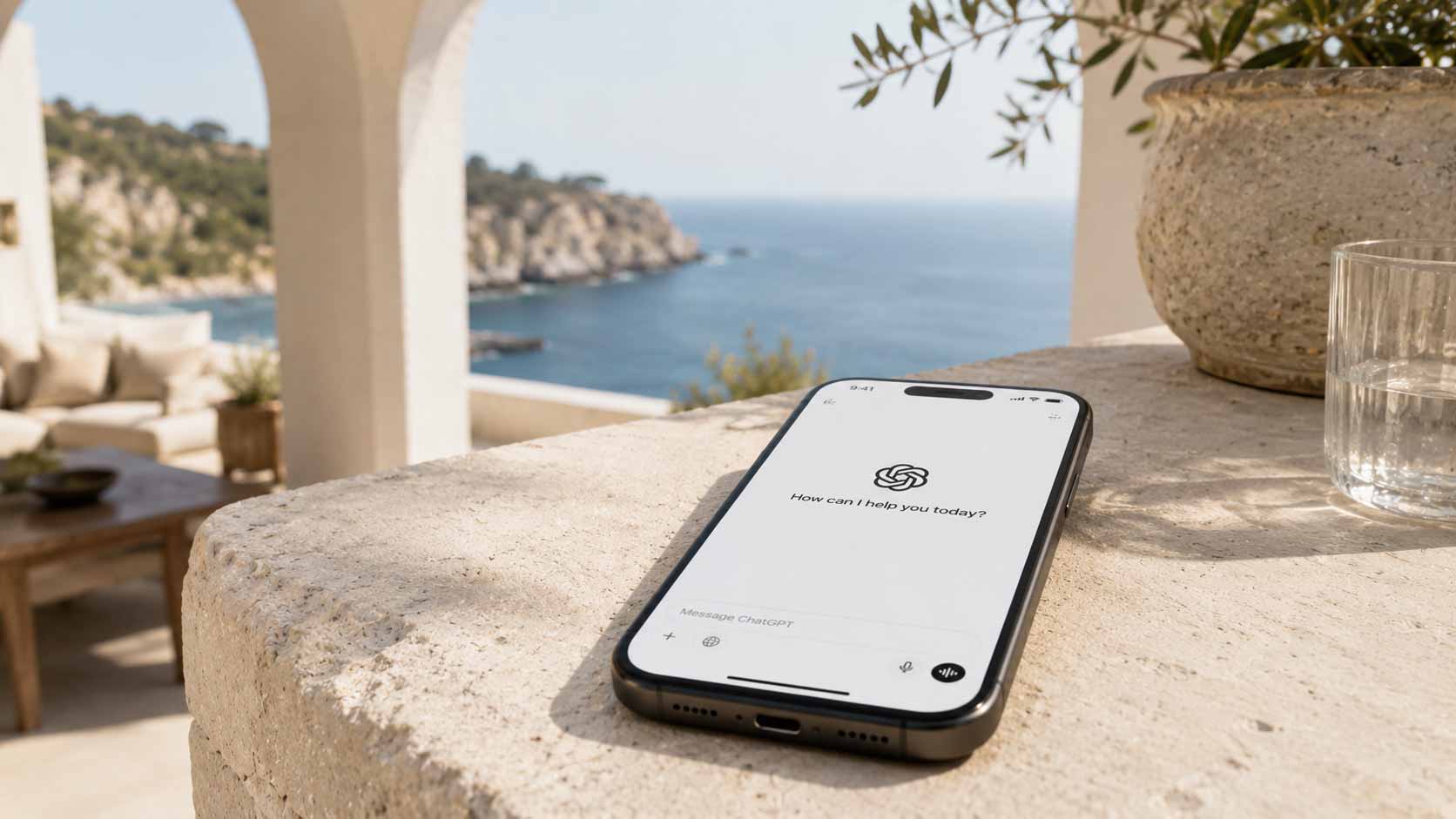
A travel advisor website is the verification layer of an advisory practice: the place where referred clients confirm that the advisor is real, current, and operating at the level the referral promised. A good one needs six core sections, costs between roughly $200 and $15,000 in its first year depending on the build path, and is judged by affluent clients in seconds, mostly on specificity and restraint.
This guide covers the entire subject in one place: what the site is for, what belongs on it, what it costs, the four ways to build it, how clients evaluate it, and the mistakes that quietly cost advisors referrals. Each section summarizes a deeper standalone piece, linked as you go. It is written by a working Virtuoso-affiliated advisor who also runs a website platform for advisors, and it is updated quarterly; the date above is current.
Key Takeaways
The website's job is confirmation, not acquisition. Referrals arrive pre-sold and use the site to verify. Cold traffic is a bonus, not the design target.
Six sections do the entire job: a qualifying homepage, a credible about page, named supplier proof, defined specialties, a living journal, and a consultation-grade inquiry path.
First-year costs range from about $200 (DIY) to $15,000+ (custom design). Most advisors land between $1,000 and $5,000 once content and time are counted.
Four build paths exist: DIY builder, marketplace template, custom designer, specialized advisor platform. The right one depends on practice stage, not budget alone.
Luxury clients judge on specificity (named properties, real relationships), restraint (editorial design, no urgency tricks), and currency (nothing stale).
AI search is now part of the equation. Clients ask ChatGPT and Google's AI results about advisors; structured, current, well-attributed content is what gets cited.
What is a travel advisor website actually for?
A travel advisor website exists to convert verification into conversation. Its primary audience is not strangers browsing for agents; it is referred clients, past clients, and suppliers checking that the practice is what they heard it is. Designing for that audience changes almost every decision on the site.
The mechanics are simple and unforgiving. A client recommends you at dinner. Their friend searches your name that night. What they find either matches the story they were told or undercuts it. This moment, which we have called the first impression you never get to make, decides more revenue for an established advisor than any amount of search traffic.
This is also why "do I even need a website" is the wrong question for any advisor who depends on referrals. The search happens whether or not you have a site to be found. The only choice is what the search returns.
What should a travel advisor website include?
Six sections carry the whole job: a homepage that qualifies, an about page that proves a person, visible supplier relationships, specialties presented as judgment, a journal that is alive, and a contact path that starts an engagement. A site with only these six, done truthfully, outperforms larger sites with filler.
In brief, with the full checklist in the dedicated guide:
Homepage that qualifies. One screen should establish who you serve and at what level. Naming your lane repels mismatched inquiries, which is the point.
About page that proves a person. The most-clicked page for referred visitors. Real name, real face, affiliation (Virtuoso, host agency), how you work.
Supplier and partner proof. The relationships are the product. Name the programs: Aman, Belmond, Rosewood, Four Seasons, the cruise lines, the villa sources. Specificity is credential.
Specialties, not service menus. Three areas of genuine depth beat twelve categories. "Flights, hotels, cruises" describes a kiosk.
A journal that is alive. Recent, substantive, on places you know. Cadence signals an open practice and gives search and AI engines something to cite.
Contact that starts an engagement. Qualify respectfully, set expectations, follow up like a professional services firm.
Equally important is what to leave off: booking engines, price-led package grids, countdown timers, uncurated social walls, and any page you cannot keep current. Advisory work is judgment and access; e-commerce furniture contradicts the model.
How much does a travel advisor website cost?
Realistic 2026 costs run from about $200 a year for pure DIY to $15,000 or more for a custom design firm, with most advisors landing between $1,000 and $5,000 in the first year once setup, content, and tooling are counted. The full breakdown, including hidden costs, is in the cost guide; the summary:
Build path | Typical first-year cost | The real cost to watch |
|---|---|---|
DIY builder (Squarespace, Wix) | $200 to $600 | 40 to 100 hours of your time |
Marketplace template | $300 to $1,500 plus builder fees | Setup effort and template sameness |
Custom designer | $3,000 to $15,000+ | The empty-pages problem: design without substance |
Advisor platform (e.g., Elite Advisor Hub) | $1,068 to $4,188/yr plus setup from $499 | Subscription, in exchange for content and maintenance |
The pattern across all four: the sticker price is rarely the largest cost. Time, photography, copywriting, and the unending work of keeping travel content current are where budgets double. Whatever path you price, price the content too.
What are the four ways to build, and who fits which?
The four build paths trade money against time and substance. DIY suits early-career agents with time; templates suit the budget-conscious who accept sameness; custom design suits established multi-advisor brands; specialized platforms suit luxury advisors who want infrastructure rather than a hobby.
DIY builders like Squarespace are genuinely good general-purpose products, and our honest assessment of where Squarespace works and breaks is the deep dive. The short version: fine until your booking mix outgrows what a generic template can signal, broken after.
Marketplace templates buy a head start on design and nothing else. You still operate everything, and you share bones with everyone who bought the same theme.
Custom designers deliver exclusivity at the highest price, with two structural gaps: they do not know the travel industry (you will pay to educate them) and they ship no substance, no supplier catalog, no editorial content, just well-designed empty rooms.
Specialized advisor platforms invert the equation: the substance is the product. On Elite Advisor Hub, every site ships custom-branded on a maintained catalog of Virtuoso-grade hotel programs, cruise partners, and villas, with editorial standards, a lead inbox, and a self-service portal, live in days. Tiers run $89 to $349 a month for independents (Agency plans from $899), differing by features rather than design quality; every tier gets a site built to the advisor's brand.
There is no universally right answer. There is a right answer per advisor, and it changes as the practice grows. The expensive mistakes are paying custom prices for empty pages, or staying on DIY past the point where it costs referrals.
How do luxury clients evaluate an advisor's website?
Affluent clients evaluate on three axes: specificity, restraint, and currency. They trust sites that name real properties and relationships, present them calmly, and are visibly up to date. They discount superlatives, stock photography, and every visual cue borrowed from volume e-commerce.
This judgment is fast and mostly subconscious. The client comparing you to their wealth manager's website and their architect's website applies the same bar: does this look like a serious operation. Editorial photography, generous white space, type that signals competence, and copy that would survive being read aloud to your best client all pass. Countdown timers, discount banners, and "unforgettable journeys tailored to you" do not.
Currency deserves special emphasis because it is the most common self-inflicted wound. A journal silent since last year, a "2024 trends" post on the homepage, a property page describing a hotel mid-renovation as newly opened: each one converts a credibility asset into a liability. A smaller site that is entirely true beats a bigger site that is partly stale.
Does SEO and AI search matter for a travel advisor website?
Yes, and 2026 is the year the second half became unavoidable. Beyond classic Google rankings, clients now ask ChatGPT, Perplexity, and Google's AI results to recommend or vet advisors. Sites with structured, current, clearly attributed content get cited; thin and stale sites are invisible in both systems.
The practical requirements overlap heavily with everything above, which is convenient:
Real content on real topics. Destination and property writing you are qualified to publish is what both search engines and answer engines reward. This is the journal earning its keep.
Clear attribution. A named author with verifiable credentials (your affiliation, your practice) is increasingly how engines decide what is trustworthy. Anonymous content is discounted.
Structure. Question-shaped headings, direct answers, clean metadata. Machines cite what they can parse.
Freshness. Both Google and AI engines weight recently updated pages. The maintenance burden that makes DIY hard is the same work that makes a site citable.
Deeper guides on advisor SEO and on the AI search shift are coming in this series; this page will link to them when live.
What are the most common travel advisor website mistakes?
The five mistakes that cost the most: building for strangers instead of referrals, claiming instead of proving, letting content go stale, borrowing e-commerce urgency, and treating the inquiry form as an afterthought. Every one of them is fixable without a redesign.
Designing for cold traffic. Optimizing the homepage for strangers while the about page, where referrals actually go, stays thin.
Adjectives instead of evidence. "Luxury, bespoke, curated" appear on every advisor site and prove nothing. Named relationships prove everything.
The dead journal. Worse than none. If you cannot sustain a cadence alone, structure the problem: a platform-curated stream, or a realistic monthly rhythm.
Volume-commerce cues. Pop-ups, timers, discount language. Each one repositions advisory work as commodity retail.
The newsletter-grade contact form. Name, email, message. A $50,000 inquiry deserves a path that takes it seriously, and clients read the form as a preview of the engagement.
How do you know if your website is working?
A travel advisor website is working when referred clients contact you without hesitation, when inquiries arrive pre-qualified, and when nothing on the site requires an apology. Three measurable signals track this: inquiry quality, referral conversion lag, and content currency. Traffic volume, the metric most tools celebrate, is nearly irrelevant for a referral practice.
Watch these instead of pageviews:
Inquiry quality. Are contact-form submissions arriving with dates, party size, and a real brief, or are they one-line price-shopping messages? A site that qualifies properly raises the floor of every conversation. If your inbox is full of mismatched inquiries, the homepage and contact path are not doing their filtering job.
Referral conversion lag. When a client tells you they have referred someone, note how long until that person actually appears, and how many never do. Shrinking lag and fewer silent losses are the clearest evidence the verification layer is passing. This is the one metric worth asking about directly: "How did the introduction go? Did they reach out?"
The apology test. Count the times in a quarter you say some version of "the website is a bit out of date" on a call or in an email. The target is zero. Every apology is a measured credibility leak, and it is the cheapest diagnostic in this entire guide.
Currency audit. Quarterly, open every page and ask whether each claim is still true. Mark anything stale. A site that passes this audit is doing silent work every night; one that fails it is undoing your reputation at the same rate.
Two further signals matter as AI search grows. First, search your own name monthly, in Google and in an AI assistant, and read what comes back as a skeptical client would. Second, check which page of your site the engines cite when they answer; that tells you where your authority actually lives and what to deepen next.
None of this requires analytics expertise. An advisor who tracks inquiry quality, asks referrers one follow-up question, and runs the apology test quarterly knows more about their website's real performance than most businesses learn from a dashboard.
Where should an advisor start?
Start with an audit against the six essentials, fix the about page and supplier proof first, then decide the build path with honest numbers about your time. Those two fixes are weekend-sized and carry most of the credibility gain; the platform decision can follow at leisure.
If the audit says the gap is structural, the four-path comparison above is the decision framework, and the cost guide puts numbers on it. If you want to see the specialized-platform answer rather than imagine it, the Elite Advisor Hub template showcase is the fastest look, and the Founding Advisor program (setup waived, first month free, founding rate held for as long as you stay) is open for advisors ready to move now.
The test never changes: a referred client, your name in a search box, 10pm. Build the thing you want them to find.
Frequently asked questions
Do travel advisors need a website in 2026?
Yes, primarily as verification. Referred clients search before they contact, and the search happens whether or not you have a site. Advisors who depend on referrals need the search to confirm the referral. The full argument, with the math, is in our referral analysis.
What makes a travel advisor website different from any small-business website?
The content burden. Most small businesses describe services; an advisor's site must prove taste, supplier access, and current destination knowledge. That substance is expensive to create alone, which is why specialized platforms exist.
How long does it take to get a travel advisor website live?
Days on a specialized platform, weeks to months on DIY (calendar time is mostly your available hours), and two to six months with a custom designer.
What is the best website builder for travel agents?
It depends on stage. Early-career and volume agents are well served by Squarespace or Wix. Luxury advisors selling on supplier relationships need advisor-specific infrastructure; a generic builder leaves the hardest content work undone. Our builder-by-builder comparison is coming in this series.
How often should a travel advisor website be updated?
Often enough that nothing on it embarrasses you: journal monthly at minimum, supplier and property information as it changes, and a full content review quarterly. Freshness is now a ranking and citation factor in both classic and AI search.
What does a Virtuoso-grade website mean?
A site whose substance matches Virtuoso-level work: named preferred-partner relationships, editorial photography and writing, and restraint in design. It is a standard of proof, not a badge.
A website built for the top 1%.
Elite Advisor Hub gives independent luxury advisors a Virtuoso-grade site in days — supplier catalog, curated editorial, and zero tech burden.